
Have you ever visited a website and thought, “Wow, this looks amazing!”? You may wonder what makes a website stand apart from the crowd. Is it the design, the content, the videos, or the loading time? Well, the truth is that it’s all of these elements and more! Creating a website that truly stands out is easier than you might think, especially when it comes to building a speech language pathology website.
In this blog post, we will take a closer look at five exceptional speech language pathology websites that have nailed the art of engaging design, informative content, and user-friendly navigation. These websites have been carefully selected for their ability to captivate visitors and deliver a personalized experience that urges them to take action. But before we dive into these inspiring examples, let’s first explore some common errors you might be making while creating your own website. By avoiding these mistakes, you can ensure that your website shines among the rest.
Too Much or Too Little Going On
One common mistake that many websites, including speech language pathology websites, make is having either too much or too little going on. It’s important to strike the right balance. When a website is overloaded with excessive content, flashy graphics, and overwhelming visuals, it can confuse and overwhelm visitors. They may struggle to find the information they need or get distracted from the main purpose of the website. One tip is to always ask yourself why the information is there. Does it help your clients understand who you are and what you have to offer them? If not, then it probably doesn’t belong on your website. On the other hand, having too little content or sparse design can make the website feel empty and lacking in substance. Visitors may not find enough information to make informed decisions or feel confident in the services offered. It’s crucial to find the sweet spot where the website presents enough relevant and valuable information without overwhelming the visitor.
Tricky Navigation
Another common problem that can hinder the effectiveness of a speech language pathology website is difficult navigation. When visitors arrive at a website, they expect to easily find the information they need and navigate through different sections effortlessly. If the navigation is confusing, unclear, or overly complicated, it can frustrate users and drive them away from the site. A poorly organized menu, crazy submenus, or lack of intuitive links and buttons can make it challenging for visitors to explore the website and locate specific pages or resources. A user-friendly navigation system is super important to ensure a positive user experience. Try putting yourself in the shoes of a visitor to your website. It may help you to get a new perspective.
5 Great Examples of Speech and Language Pathology Websites
Each of these websites offers a unique approach to showcasing their therapy services and connecting with their audience. Keep reading to see why we think these websites stand out.
We love this website, mainly because it is so welcoming and bright. When you first visit their homepage, you can’t help but feel a sense of warmth and positivity. The vibrant colors they use instantly put you in a good mood. They’ve got a great balance of clear and concise text along with eye-catching graphics, making it super easy to understand the services they offer. Plus, navigating their website is a piece of cake. Everything is laid out so intuitively that you can easily find what you’re looking for without getting lost. It’s clear that they’ve put a lot of thought into creating a comfy and supportive online space for people seeking speech and hearing services.
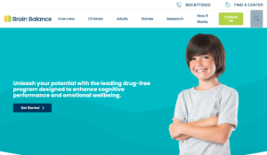
This website is a standout example, particularly because it caters to its audience. Right from the moment you land on the homepage, you can tell that it’s designed with parents in mind. The lively and vibrant colors, along with playful graphics, create an engaging and child-friendly atmosphere. The website exudes empathy, understanding the challenges that parents face when it comes to their children’s development. It offers a wealth of valuable information about the services they provide, while not overwhelming. The testimonials and success stories featured on the website further reinforce the sense of empathy and trust. Brain Balance Centers has succeeded in creating a website that not only informs but also connects with its target audience on a deeper level.
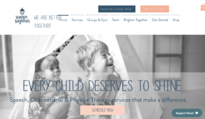
We love this website, thanks to its excellent use of soft colors and beautiful imagery. From the moment you arrive on the homepage, you’re greeted with a soothing color palette that creates a sense of calm and tranquility. The carefully selected images feature diverse children engaged in various activities, showcasing their individuality and potential. The website’s overall aesthetic evokes a feeling of empowerment and inclusivity. It emphasizes the belief that every child has unique strengths and abilities waiting to be discovered. By combining visually appealing design elements with a message of empowerment, Better Together Idaho has created a website that not only captures attention but also inspires parents and caregivers to recognize and nurture the potential within their children.
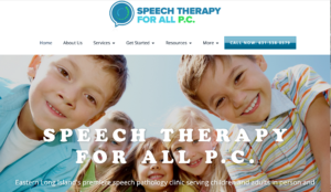
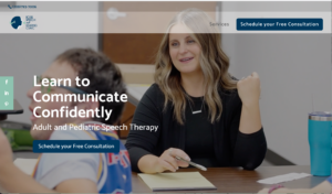
Speech Therapy for All excels in its exceptional navigability and bright, welcoming design. You’ll notice how easy it is to find your way around. The navigation menu is clear and well-organized, allowing visitors to quickly access the information they need. The website’s bright color scheme, featuring cheerful hues and inviting visuals, creates a warm and friendly atmosphere. It immediately puts visitors at ease and conveys a sense of openness and approachability.
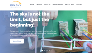
Big Sky Friends truly shines in showcasing their unique message and expressing their core values through their exceptional copywriting. As soon as you visit their website, you are immersed in a world that radiates vibrancy, inclusivity, and authenticity. They are able to capture their belief in the power of children and the potential they have through both their words and pictures. You really get a sense of who they are as a practice.
A Parting Thought
Your website serves as a powerful tool to communicate who you are as a speech language pathology professional and what you can offer to your clients. By empowering and inviting them through your website, you create a welcoming space that resonates with their needs and desires. Take the time to carefully consider the design, content, navigation, and overall user experience of your website, ensuring that it will resonate with your ideal client.