

Have you ever wondered what makes a website stand apart from the crowd? Is it the design, the content, the video, the loading time, or all of it together?
Well, the answer is all of the above and more! Having said that, creating a website that stands out in the crowd is easier than you think, especially if you are building a therapy website.
In the article, we will explore 5 great examples of therapy websites and discuss what makes them so good as to include them here. But before that, let’s talk about a few common errors that you could be making while creating your digital address.
Common problems your website could be having right now
Too much or too little going on
On a therapy website, your visitors will be people looking to help themselves or family members with a problem. So make it clear what services you offer and how it can help them or their loved one.
Be thoughtful as to what you put on the website. Ask yourself, “what is the purpose of this content?” Will it help them understand how our clinic will help them?” If you can’t clearly answer those questions, it may not belong on your site. A lot of businesses want to wow website visitors with flashy content or video that doesn’t really serve a purpose other than to clutter the space. It may be really cool, but your website is not for you. The primary purpose of your site is to communicate to prospects how you can help them with the services you offer.
Misuse of whitespace or content
Whitespace is the space around an image, video, written content, etc. It does not have to be white. It can be any color and is space around a page element. It allows the viewer to digest what is in a webpage section. First, break large chunks of text into smaller units as readers skim a website for interesting content. Second, the proper use of whitespace gives eyes a respite and helps the viewer make sense of the information.
Just like the placement of content matters on a webpage, so does the readability! Carefully choose a font that is easy to read, as your visitors won’t put in the extra effort to read fancy text. In addition, people with visual impairments or younger generations may struggle to read handwritten or cursive fonts.
When you pay close attention to both of these, visitors will easily navigate the content of your website and, hopefully, take the next step in working with you.
Now that you know what not to do regarding content and design let’s look at some good examples of therapy websites.
5 Great Examples of Therapy Websites
Therapy websites that have made this list have one thing in common- the user journey of visitors on all these websites feels personalized and urges them to take action.
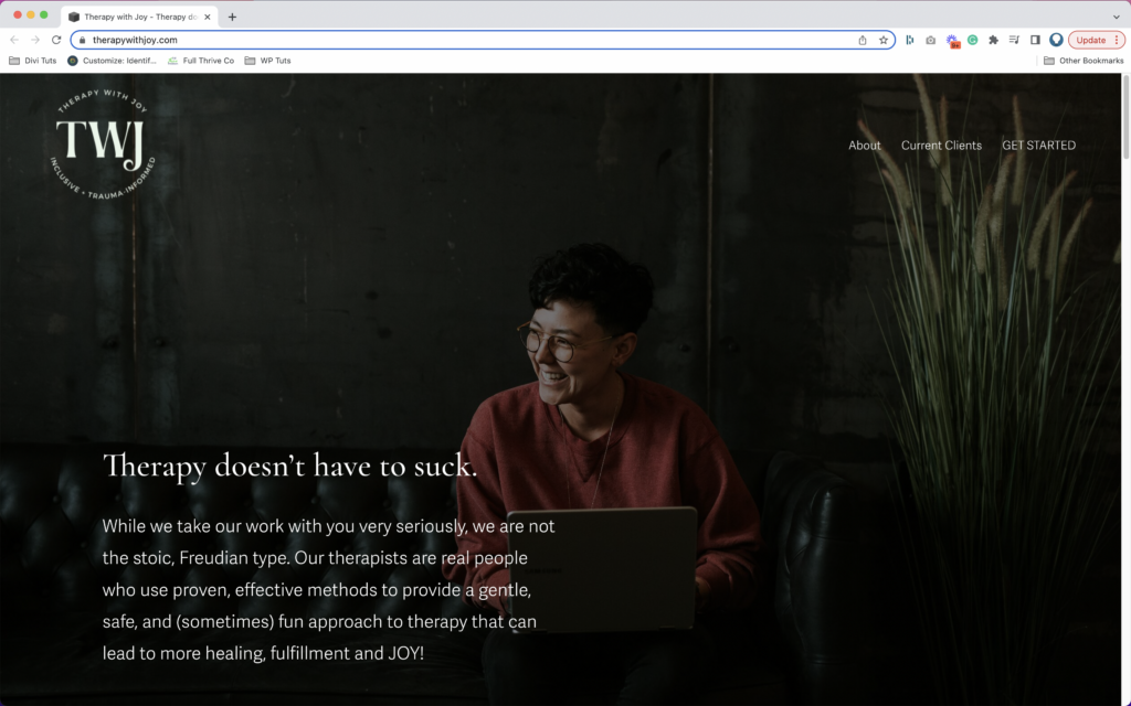
The homepage of Therapy with Joy is dark, with clean text that says, “Therapy doesn’t have to suck.” There is a perfect use of an image where a person is smiling, almost ear to ear.
This website stands out because the text doesn’t claim to change your life. Instead, it resonates with how you feel and assures you that therapy doesn’t have to be a bad experience when you find the right therapist.
Then the dark background moves to a white one with black text asking you if you have any of the following struggles. This helps the reader identify if the clinic can help them. Once they agree that the questions resonate with them, they say, “We can help.” This conversational style of writing is captivating and keeps you reading.
Below this section are two call-to-action buttons in green, a color that signifies action. One reads Meet “Our Therapists” and the other “Request Appointment.” The simplicity of the website stands out, making it a great example.
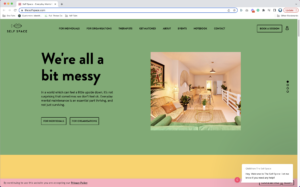
The Self Space does it right to offer visitors a sober yet vibrant website navigation experience. It showcases perfect light-muted colors along with modern flat icons and attractive font.
The use of whitespace is another major plus point for The Self Space website. The copywriting is as straightforward as it grips the readers’ attention and keeps them hooked until they hit the call to action button.
This website is welcoming. The mild-colored textured backgrounds are warm and invite you to explore more.
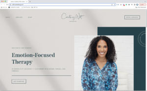
Since establishing a connection with your therapist is crucial, Courtney uses her image on the homepage, which adds a face to the brand, helping you further connect with her.
The copy is smartly written, containing action-word that trigger you to hit that CTA button. Overall the website looks like a cozy place to be in, just like a place a person seeking therapy for oneself or loved ones would want to be in.
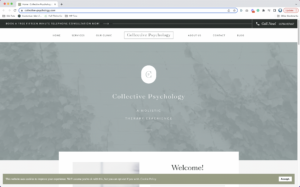
The best part of the website is how clean it looks yet contains enough content to know how you can get help. The monochromatic colors have a calming effect on the mind.
The content is conversational. As soon as you scroll down the homepage, it says, “We are here to help.” This assurance is quite comforting to visitors looking for therapy for the first time and don’t know how to go about it.
Overall, the website is pleasing to the eye with sufficient whitespace and content.
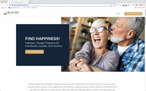
As soon as you open the website, you are welcomed with the happiness prompt, which is desired as therapy’s end goal.
The page is designed in a modern and minimalistic fashion. A clever use of the color blue is made throughout the website, going along with the name “blue sky.”
The website is clean and super easy to navigate. Within a minute of viewing the website, you understand the services offered, the benefits it will bring to your life, and how to get started.
The simplicity and the clear message of this website is what make it stand out.
Final words
When creating a great website, consider what your visitors want to know about your practice, your services, and you. Put yourself in the shoes of people looking for therapists like you and think from their perspective. This will allow you to create a great website that resonates with them.