

As if creating a website wasn’t difficult enough, now we are telling you that you actually need to pay close attention to the font? I know, I know. Sorry about that. You may be thinking, “Why does it matter what font I use on my website?” Believe it or not, the font you choose for your website can make a huge difference in how visitors perceive it. Fonts can impact the mood and tone of your website, convey professionalism or playfulness, and even affect how easy it is to read the content. A font that’s too bold or too thin can be distracting, while a font that’s too fancy can be difficult to read. So, when it comes to website design, don’t underestimate the power of the font.
We don’t want to overwhelm you, so we chose the top 5 things you need to consider when choosing a font for your website. From mood to weight and harmony to serif– whatever that is, we will give you all the basics that you need to know to make the best decision for your clinic’s website.
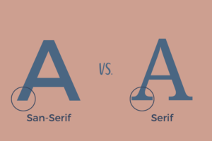
1. Serif and Sans Serif
In a nutshell, serif fonts have small lines or flourishes at the ends of each letter, while sans-serif fonts do not. Generally speaking, serif fonts are more traditional and formal, while sans-serif fonts are more modern and casual. This doesn’t mean one is better than the other, but rather that they can convey different feelings and attitudes. Again, think about your audience and brand when deciding which type of font to use. We actually suggest using both! But make sure that they are roughly the same height as one another.
Font combinations that work well together:
- Montserrat (sans-serif) with Georgia (serif)
- Lato (sans-serif) with Merriweather (serif)
- Open Sans (sans-serif) with PT Serif (serif)
- Roboto (sans-serif) with Garamond (serif)
2. Mood
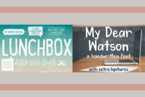
Your font choices can help or hurt the mood you want to convey on your website. Do you want to come across as approachable and friendly? Professional and authoritative? Fun and playful? For example, a sans-serif font like Arial or Helvetica can give off a modern and clean vibe, perfect for a professional website. On the other hand, handwritten fonts like Lunchbox or My Dear Watson can give off a playful and whimsical feel, great for a pediatric therapy clinic. Keep your target audience and brand identity in mind when choosing a font that matches the mood you want to convey.
Quick Tips From the Experts
Fonts to Avoid:
- Comic Sans
- Chalkduster
- Papyrus
- Bradley Hand
- Curlz
- Vivaldi
- Copperplate Gothic
Fonts We Love:
*All of these are free Google Fonts
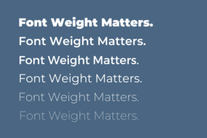
3. Harmony and Weight
The harmony and weight of font choices can speak volumes, but what exactly are they? Harmony means the font combinations go well together. They don’t take away from each other and they don’t compete with each other. When discussing weight, we are referring to the boldness of the fonts. It’s important to choose fonts that work well together and have a good balance of boldness and lightness. Make sure the two fonts complement each other and create a cohesive look throughout the website. A good rule of thumb is to choose one heavier font for headlines and another lighter font for body text. Also, consider the weight of the font – is it too thick or too thin? A font that is too heavy can be overwhelming, while a font that is too light may be hard to read.
4. Test it out!
Once you’ve narrowed down your font choices, it’s time to test them out. Play around with different combinations of fonts and see how they look on your website. The great thing about fonts is that you can rapidly switch between them by selecting all the text and changing the font. Don’t be afraid to ask for feedback from colleagues or friends. Sometimes a fresh pair of eyes can spot something you missed, and we all know what it’s like to look at something for way too long and not have clear vision anymore.
5. Get Some Help
Finally, if all of this font talk is making your head spin, consider hiring a professional. Graphic designers and web developers can help you choose the perfect fonts for your website and ensure that they are used in a way that maximizes their impact. While it may be an added expense, it can be worth it in the long run to have a website that looks polished and professional. There may also be options to hire some help from a consultant instead of hiring someone to do it all for you.
One More Thought
There’s a lot more to picking a font than you thought right? While fonts may seem like a small detail in the grand scheme of website design, they can actually have a big impact on the effectiveness of your site. Keep in mind the mood you want to convey, the harmony and weight of fonts, and the ease of testing them out. As always, reach out to us if you need some help! With the right font choices, your website can be a beautiful and effective tool for showcasing your unique message.