
Have you ever been in love? Did everything seem rosy to you? Did you want to buy red heart-shaped pillows, red candles, red roses, and just about anything that was red? After your breakup, did you ask yourself- what did I see in him/her? And immediately came the reply – du-oh! You were wearing rose-tinted glasses, hence the red flags seemed like mere flags.
Growing up, did you have an emo-phase where you only dressed in black and listened to Evanescence and sported a look with kohl-filled eyes? Do you associate yellow with sunshine, brightness, joy, and general happiness? Does the color blue make you think of Santorini and the beautiful architecture it has to offer?
Is mentioning the above colors evoking some feelings in you and taking you on a whirlwind of emotions? Well. Dear reader, welcome to the psychology of color and the influence they have on us!
Understanding Color Psychology
The area of research that deals with how colors influence our decision-making and general behavior is typically known as color psychology and is heavily used in marketing and sales. Imagine viewing everything in greyscale? You open Nordstrom’s website and everything is in greyscale! How could you shop?!
The effect of color on our minds is so powerful that just the color of the call-to-action button can lead to higher clicks. With the same content and design, just a change in color of the button could lead users to click on it more. Such is the power colors hold on our decision-making.
Based on how dominant the effect of color is on the mind, different brands choose the color palettes for their business and also for their products and offices. International food chains often use red in their physical outlets, websites, and even in their logos.
You may think that brands pick a color and stick to it for brand recall. Yes, that is one part of it. Choosing a color is 99.9% of the time a conscious effort to set the right tone for the kind of people you want to target.
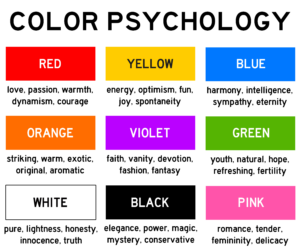
Red is one of the most popular colors used in marketing but before you choose red to be your color, consider the kind of emotions that we associate with it. The emotions that are triggered by this vibrant color are extreme. Love and warmth on one hand and aggression on the other. So, you need to balance the colors you choose in order to reap the benefits of their effect on your client’s mind.
Besides red, you can also use other warm colors like yellow which triggers a happy feeling, and orange which creates a sense of excitement.
Let’s take a look at the restaurant that is present in more than 119 countries- McDonald’s. A vibrant yellow ‘M’ with a red background- was this combination carefully chosen or was it random? The choice of two warm colors was intentional. Warm colors like red, orange and yellow evoke feelings of comfort and warmth which causes one to feel at home and you tend to eat as much as you would at home.
Similarly, resorts often use shades of green, blue, and other colors that have a calming effect on the mind. The way you feel when you are at a certain place is often because of the kind of color that you see around you. That is exactly the reason why you will see early childhood education centers filled with warm colors while examination halls with more of a neutral color palette.
Let’s take a look at the color and design for Calm, the world’s leading application for meditation and sleep. Born out of San Francisco, the app wanted to ensure that just by looking at its logo and design, people understand what it’s going to do. The light blue to dark blue gradient and the wavy white font all clearly indicate a peaceful state of mind, instantly calming our nervous system and taking us to a place of rest.
How to choose the right color for your therapy clinic?
A white room with a cushioned couch where you can lie down and minimalist decor with neutral colors. That is how movies have often shown therapy clinics to be. However, that is not how your clinic needs to be at all. Depending on the niche that you choose, you can select the color that helps you attract the right kind of people.
If you are a person-centered therapist and would like the focus to be on the therapeutic alliance and building a safe space, opt for neutrals like beige. You could go with rattan or wooden furniture, and to bring the room together, introduce some pieces of art in pastels.
If you are into art therapy then you can go for vibrant and warm colors. You could have huge paintings with bright colors. Have a space for little and young clients to display their skills. You could also have a wall with tools and arts-crafts material in the waiting room.
However, if you specialize in anxiety and stress management, you can replace the bright color palette with cool shades of green, blue, and purple.
Given that your clients already have a range of emotions that are intense, you may not want to use colors that could aggravate those feelings. For such therapy clinics, go for cool colors. Also, earthy tones like brown and gray are calming and create a sense of peace and tranquility.
What are some of the benefits of choosing the right colors for your therapy clinic?
1. Sets a tone and creates a comfortable atmosphere. People don’t remember the big things in life. They however remember how you made them feel. And if you were able to make your clients feel welcomed and understood, you’ve made a difference in their lives.
2. Differentiates your clinic from the rest of the market. In today’s day and age of information and access, there are 20 other people vying for your client’s attention. Use colors to your advantage and build a brand around them.
3. Attracts the right clients to your clinic and grow from there. Business owners often learn this lesson (sooner than later) that they would much rather deal with a few clients than a slew of wrong clients!
Conclusion:
We are in the business of emotions and if we are able to convey respect and understanding of a client’s needs from the get-go, building trust will be significantly easier. Just as having a clear intake process helps you offer a better service, paying attention to color also takes you the extra mile.